


Introduction
In an era where the average credit union member’s age hovers around 53, the challenge of adapting to the ever-evolving digital landscape to engage younger generations is more pressing than ever. With Gen Z and Millennials making up over 50% of the U.S. population, credit unions find themselves at a crossroads. How do they capture the attention and loyalty of digital natives who have grown up in a world shaped by tech giants like Apple, Amazon, Spotify and Netflix, all while ensuring they continue to cater to their existing member base?
We will explore the strategies that credit unions can employ to navigate this balancing act. We will also delve into the importance of user-centered design, the core journeys that should guide your app development, and the principles of mobile design that can captivate Gen Z, Millennials and your existing members.
The Core Journeys & User-Centered Design
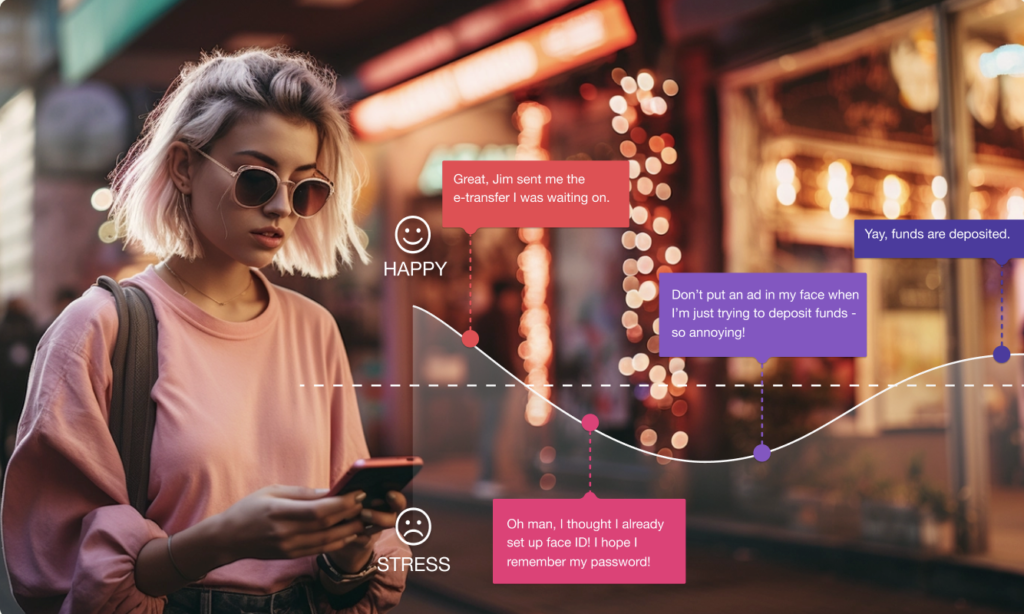
When developing a mobile app, it’s vital to start with the basics — those core journeys that your app must facilitate. Credit unions, primarily offering personal banking services, revolve around financial tasks. For your members, the core journeys involve day-to-day banking activities such as moving money through transfers and deposits. If you offer direct investing, making a trade or placing an order is essential.
Serving these core journeys with speed, simplicity, and clarity is the first step in the right direction. However, it’s not enough anymore for your mobile app to meet the bare minimum. To truly engage and retain users, you must consider who they are and their context (where are they using your app), their stage of life (Do they need a loan or are they looking for a mortgage), what delights them (maybe advice on their spending habits, rewards, sustainability or connection to a personal advisor), along with delivering on your brand promise (what do they expect from your brand).
Understanding your Unique Value
What is your brand promise and who is your key audience? Consistently communicating your brand through all of its channels and platforms is important. Is it about safety and security or is it about living life and having fun?
Take, for instance, BlueShore Financial, a local credit union in B.C. With a strong brand presence that presents financial services as a financial spa, BlueShore focuses on caring for its members as humans, not just as wallets. Their branches are calm and welcoming. It’s about living a great life and achieving your goals. Whereas most other branches can be uninviting, this is a place to relax and set yourself up for financial success.
This unique approach is an effective way to stand out in an industry dominated by major banks. However, the next big opportunity for BlueShore lies in extending this exceptional experience to their mobile app. Aligning their app to lifestyle brands, like Starbucks, Nike, Apple, or Lululemon, where the experience is modern, quick and with little friction is a promising starting point, offering a unique opportunity to attract younger generations while avoiding pain points for older generations.
Principles of Mobile Design
To create a mobile app that resonates with users, there are five essential principles to consider:
- Navigation: Start with a solid information architecture and organize your app into core sections. Keep the primary menu items to a manageable 4-5, like Scotiabank’s “move money” section, which provides easy access to various financial actions.
- Visual Hierarchy: Establish a clear visual hierarchy that aligns with users’ reading patterns. Place your header or page title prominently, followed by the most important information for that screen.
- Readability: Prioritize readability with a font size of 14-16px for default text. Sub-text can be slightly smaller, around 12px, while allowing users to customize their font sizes for comfort.
- Accessibility: Ensure your app meets accessibility guidelines, from descriptive button labels to logical focus order, color contrast ratios, and finger-friendly tap zones.
- Leveraging Standard iOS and Android Patterns: Respect the design guidelines of iOS and Android devices. Customize where it adds value to users but avoid making your app feel like a foreign experience on either platform.
Conclusion
The path to designing a great mobile app for credit unions involves striking a delicate balance. On one hand, it requires nailing the core user journeys to offer members speed, simplicity, and clarity. On the other, it necessitates understanding your members and your unique value proposition, something exemplified by BlueShore Financial.
The five principles of mobile design, focusing on navigation, visual hierarchy, readability, accessibility, and adhering to standard patterns, are the building blocks of a captivating and usable app. By applying these principles and embracing innovation, credit unions can successfully bridge the generational gap and excel in the digital age, ensuring that their members continue to receive the exceptional service they deserve.
By incorporating these insights into your mobile app design strategy, you’ll be well-equipped to thrive in a world where attracting and retaining the loyalty of both the digital generation and existing members is key to success.
Interested in diving deeper into creating captivating mobile banking experiences for the next generation? Engage with the AEQ team to explore innovative solutions tailored for your credit union.
Are you a CU leader keen on harnessing the power of UXUI and digital innovation? Connect with the AEQ team for a personalized consultation, and let’s explore collaborative opportunities to elevate your credit union’s digital journey.


Helena Menager
Helena is a design professional with 14 years of experience leading the creation of digital experiences in regulated industries with passion, kindness, and a can-do attitude. Her approach is human-first and purpose-driven from the methodologies she follows in her design process to how she operates as a design leader. Helena has helped businesses and teams understand the behaviours and needs of their customers/clients/users, transform insights into solutions, map solutions to goals and build out experience visions (based on facts and data) that teams can rally around and work towards.
