Interaction design is composed of a bunch of little elements. When orchestrated beautifully, it can create big things. In this article, I hope to explain the micro complexities behind interaction design and how, when brought together as a whole, they can have a macro impact on your product, team, clients and most importantly the user.
We will explore some qualitative reasoning, principles, tools and practices (I promise they will not be boring!). And then some sort of finale that leaves you with new knowledge, perspective, and hopefully an understanding of how powerful interaction design (IxD) can be for you and your product.
“Designing a good user experience hinges on the interactions within it. Good interaction design, therefore, forms an integral part of great UX design.”
Imagine a product that functions well, but lacks any emotional connection. Without interaction design, your product can create an otherwise negative experience for users, even while engaging with your product just once. Considering the impact of first impressions, chances are likely that users won’t come back even if your product is the best out there. Times have changed, and the fact is that good user experience design hinges on the interactions within it. Good interaction design, therefore, forms an integral part of great UX design.
In today’s saturated and fast-moving digital landscape, tech-savvy users are becoming more and more educated, evolved, and, at times, bored when it comes to digital products. They are looking for more than mere functionality; they want to be left feeling delighted and possess a sense of connection with every interaction they encounter. Sure, you may have an outstanding product or service, but are you carefully considering the experience customers must take to get to it? Furthermore, have you considered whether or not it is equal in value to the end result? Big things have small beginnings, and interaction design can provide the perfect starting point for your digital product.
What is interaction design?
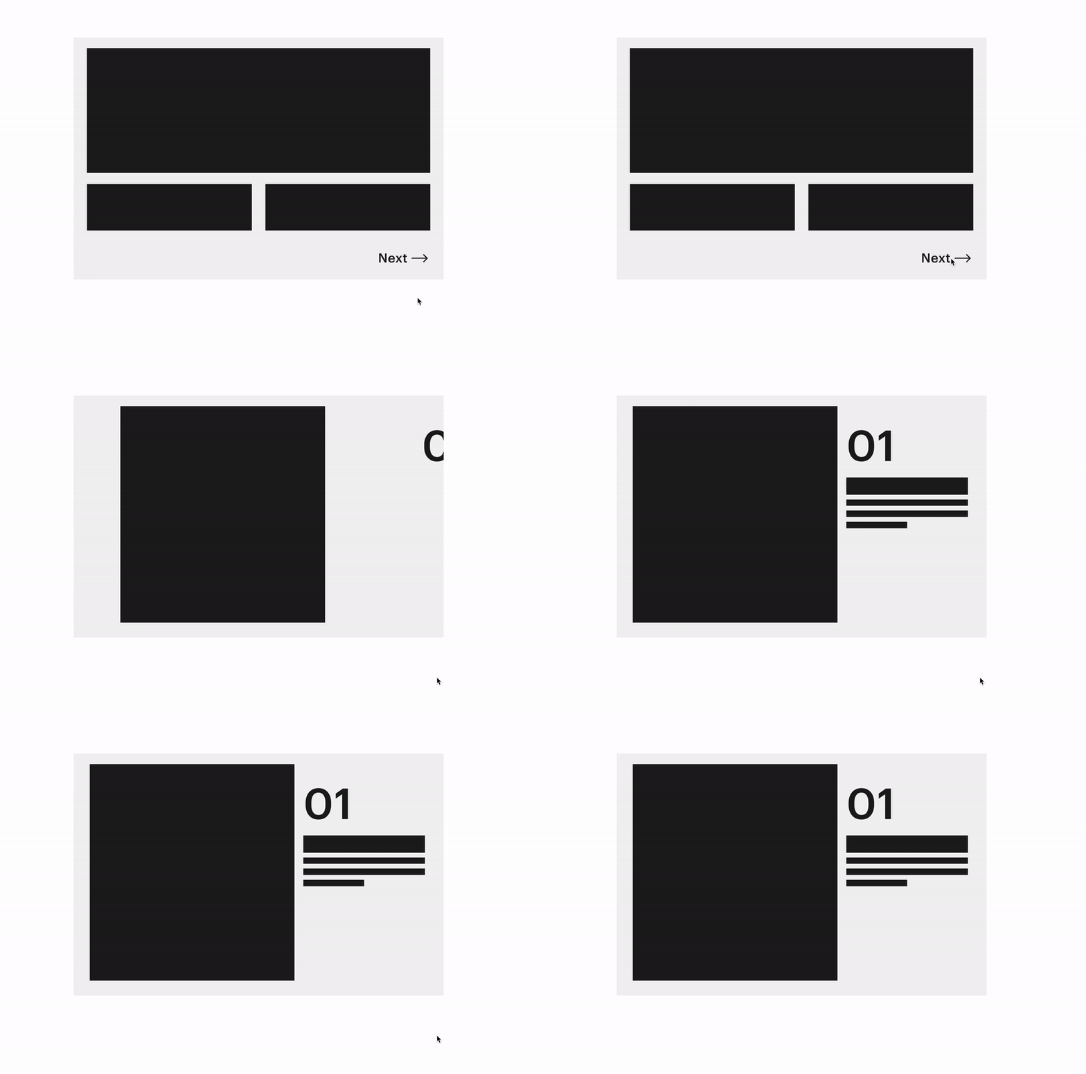
Sometimes you can’t put words to it, or explain it after an initial experience, but something about how that page transitioned logically, how that content went from a condensed state to an expanded one, or how that bio image had three-states of hover to minify content so the user could decide whether to engage naturally.
The Interaction Design Association (IxDA) defines interaction design as the structure and behavior of interactive systems (2019). In simpler terms, interaction design is about making the connection between a device, its interface, and the user. It facilitates the actions we want to take. Anytime you perform a function on a digital device, interaction design is what makes it happen, making a framework of text, components, and objects useful, learnable, and ultimately intuitive and sometimes even super fun! It delivers that almost human element that makes technology enjoyable and pleasant to interact with, or in other words, delightful. At its core, it is fundamentally centered around the human connection, a guiding principle at aequilibrium.
Interaction design goes beyond making something merely work well or look good (yes, even today, a lot of people think UX is making a screen look pretty). Instead, it focuses on creating an experience for the user that feels intuitive, exciting, and ultimately feeling like they’ve encountered something great as a result of the person behind this product really understanding who they are at the micro-level.
User Action
The action that a user performs in order to interact with an element on an interface. In the case of smartphones, these actions are called gestures. Some examples of gestures include tap, long press, swipe, and pinch.
Reaction
Reaction covers everything that happens on the interface as a result of the user action. This reaction could be limited to an element or could span over multiple elements of the interface. It could also be around manipulating various properties, such as shape, orientation, and elevation, or one or multiple elements.
Perception
The reaction of the interface builds a perception of how the elements on the interface behave against a certain action. This perception helps them make sense out of the interaction and understand how the product works building their mental models over time.
You can learn a little bit more about how to improve UXD with interaction design here.
The dimensions of interaction design.
Gillian Crampton Smith, an interaction design academic, first introduced the concept of four dimensions of an interaction design language. Since then, more have been added as the tech world has advanced. At aequilibrium, we use a six-dimensional model to guide our understanding.
1D: Words
Words—especially those used in interactions, like button labels—should be meaningful and simple to understand. They should communicate information to users, but not too much information to overwhelm the user.
2D: Visual representations
This concerns graphical elements like images, typography, and icons that users interact with. These usually supplement the words used to communicate information to users.
3D: Physical objects or space
Through what physical objects do users interact with the product? A laptop, with a mouse or touchpad? Or a smartphone, with the user’s fingers? And within what kind of physical space does the user do so? For instance, is the user standing in a crowded train while using the app on a smartphone, or sitting on a desk in the office surfing the website? These all affect the interaction between the user and the product.
4D: Time
While this dimension sounds a little abstract, it mostly refers to media that changes with time (animation, videos, sounds). Motion and sounds play a crucial role in giving visual and audio feedback to users’ interactions. Also of concern is the amount of time a user spends interacting with the product: can users track their progress, or resume their interaction some time later?
5D: Behaviour
This includes the mechanism of a product: how do users perform actions on the website? How do users operate the product? In other words, it’s how the previous dimensions define the interactions of a product. It also includes the reactions—for instance emotional responses or feedback—of users and the product.
6D: Accessible
Do the interactions used within the product adhere to accessibility compliance guidelines across all touch-points?
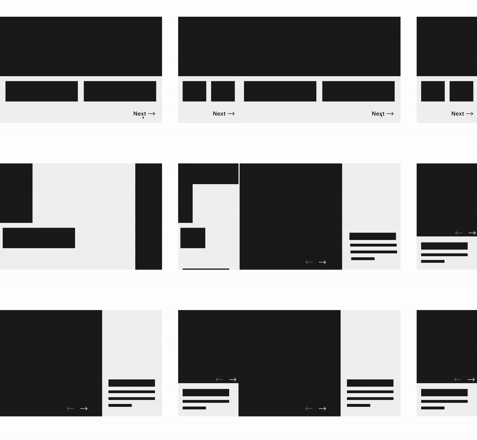
While interaction design encompasses the complete customer journey and all of the associated touch points, for the sake of time, in this article I am going to focus on the impact of interaction design as it relates to user interfaces, user experiences and workflows in product design.
The intangible but measurable qualities of interaction design.
When we conduct usability studies at aequilibrium, there is often a subtle subterfuge in the design, which is to increase a qualitative score as it relates to an interaction to push. Often in projects, the ‘gold-platting’ functional interaction design gets binned to fill more features, which, don’t get me wrong, sometimes this is for the greater good. When we design workflows, though, we often overlook the intangible interaction design as a UX score improvement method. By A/B testing hi-fi prototypes with interaction or animation designs to validate a baseline workflow versus the static workflow, we often receive higher qualitative usability scores.
Now, this may seem obvious, but these are emotional qualitative scores based on a quantitative tasks. Group A, with static workflows, compared to group B, with animated workflows, scored lower on every task, but they couldn’t even explain why. The hypothesis I had was that I could reduce the cognitive load by simplifying the workflow and increase the UX qualitative user score by adding a simple transition interaction design between tasks. Based on the data I give back to the team and stakeholders, the interactions will typically get approved and put into production.
Efficient state of being.
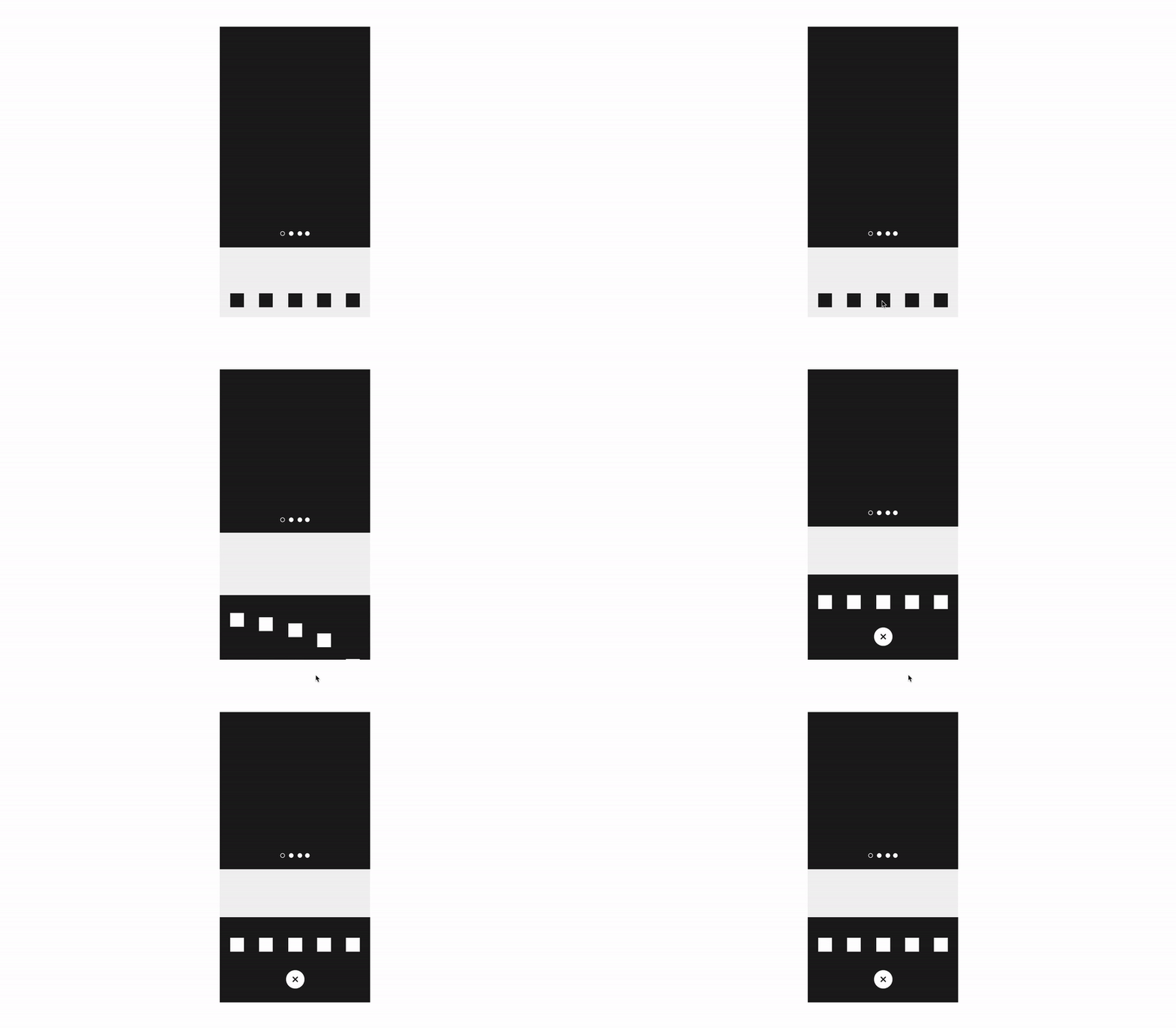
Another subtle yet very impactful purpose of interaction design is the ability to give everything multiple states. By using interaction design, we can give a crowded space on say a smartphone layer of interactivity, both on the Z-index but also on the UI itself. Animated interaction design allows product and UI designers to explore another ‘hyper-space’ of design thinking: What was once a simple mobile navigation bar now becomes a two-state navigation drawer with a subset of child functions from a parent function.
Tools of the trade.
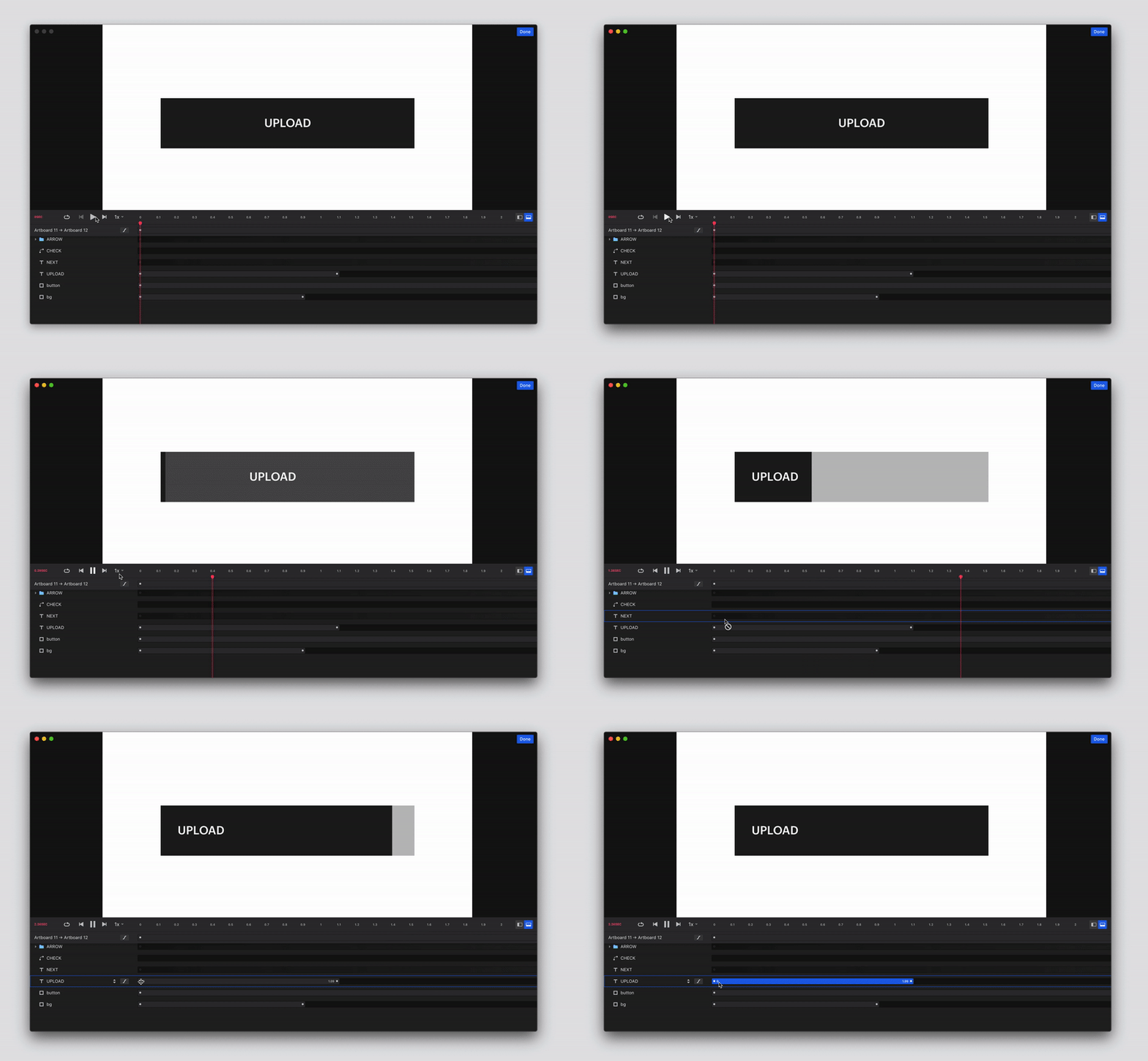
Before interaction design was possible, we would to draw a million sketches on a white board with all sorts of crazy arrows, song, and interpretive dance to get our point across to the QA, development team, PM’s and clients. Eventually we graduated to exhaustive Sketch designs and discussions with the development team to explain our intent that we realized this was massively inefficient for everyone– the pains were not worth the gains. Now, with powerful design tools like Framer, Marvel and one of our favorites, InVision Studio, we can create and clearly communicate a hi-fidelity interaction design to the team as well as provide high-level CSS attributes, sizing and positioning using the ‘inspect’ mode. The sharing and commenting features in Studio allow us to quickly and easily talk about the interaction design throughout the entire team, right to the clients- utilizing a collaborative process to create a better outcome.
At the end of the day, it’s really about offering value to the user, improving experience design with everything in our tool belt, and constantly trying to push the efficiency in our design right to the edge of breaking it. The user should think less and just enjoy the product, even if it’s the dreaded on-boarding workflow. Set yourself a challenge like this and you may surprise yourself at what results you discover and how to approach your next design.

Mini-challenge scenario:
On your next or current project, experiment with an easily-adoptable interaction design for one of your many components and related workflows. Try and find a small but significant scenario to utilize interaction design.
Depending on your experience level, try to keep it easy for you to not only design but to communicate to the team about it. When you think you have a scenario designed, compare it to the current design or the design you would have used instead. This will help you create a scoring mechanism. Now you can use this as a testing baseline to draw feedback from, and also to comparatively sell your case to the development and product teams for critical buy-in. If you think you have a winner, run a hush-hush internal usability feedback study and present this data to your team, too. When you feel like you have all of the evidence and a plan of action to execute your interaction design, present it to your product manager and development team or key stakeholders.
Mini-challenge outcomes:
- Buy-in from departments and key stakeholders that your interaction design adds value
- Data through user feedback score to validate your assumption
- Increased qualitative UX score
- New learnings with your team
- Improved interaction design game
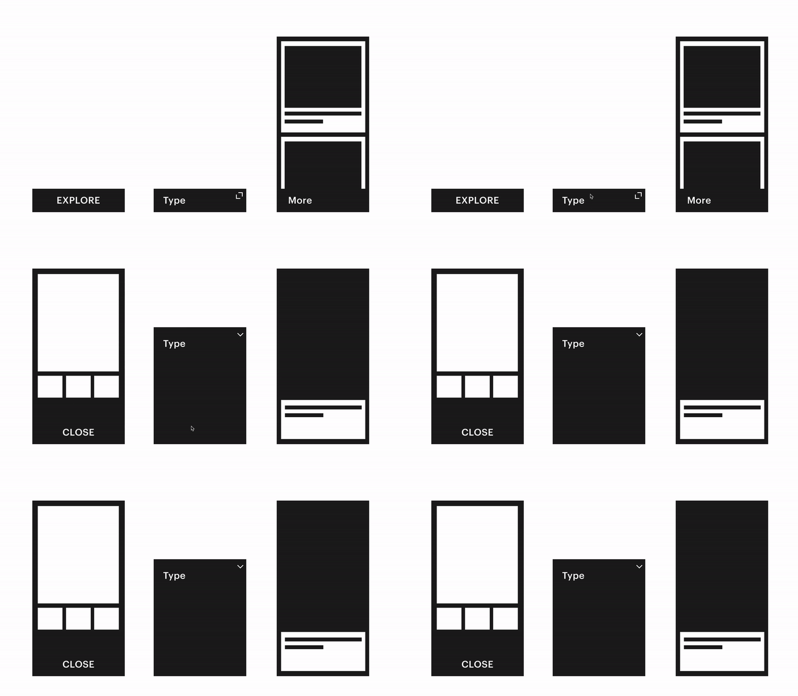
“…advanced efficiency, that means thinking on multiple planes and in multiple dimensions…”
– SR Hadden, Contact
A team effort.
At aequilibrium, we involve the development, QA, and product teams whenever possible in the design process to make it collaborative. Sometimes, you never know the hidden expertise of your teammates, and even better, the enthusiasm they may be able to contribute to your design. These small iterative steps will help you build a foundation for proving the importance of interaction design. Whether it’s macro- or micro-interaction design, both can take your product to the next level.
So, the conclusion here is simple: any animation which is applied to the interface should have a clear purpose enhancing user experience. In most cases, UI and motion designers will try to find design solutions in which animated elements will satisfy multiple options increasing usability and desirability of the interface.
Nowadays, animation has won its special place in interface design as one of the most important tools for successful interaction. As people are visually-driven creatures, the force behind the picture which is worth a thousand words becomes even stronger with the help of interaction and animated design, especially with the growth of mobile devices. Animation is a very powerful way to make the product simple, clear, bright and user-centred providing surprise and delightful user experience.

Micro interactions all have their own unique place. But when you step back from the micro and look at the macro, you’ll notice something quite powerful–a new intangible experience that you can’t really put your finger on but it’s there and serves a purpose. Big things have small beginnings.


