7 min read
When I was a UX Design student at BrainStation back in 2017, usability testing stood out to me as one of the most valuable lessons I learned in the process of becoming a UX designer.
Although over the last few years my testing techniques have evolved, the methodology remains the same. User-driven insights are what’s at the core of human-centered design methods, and from my experience working at aequilibrium, usability testing will undoubtedly improve your digital product.
If you’re not conducting tests regularly, you may be missing out on the whole point of creating digital products, which is to use user-driven insight to discover the opportunities that create products of real value in peoples lives.
Because insights are grounded in human needs and desires, they lead to ideas that create value in people’s lives. -Coe Leta Stafford, IDEO Global Design Director
What is a usability study?
Usability studies test the functionality of a product by observing real users interacting with it. Some people confuse user testing with usability testing; they sound similar, but there is a clear difference when you understand the function. User testing tests an idea, and asks “Will a user use my product?” whereas usability testing tests a product and asks “Can this user use this?”
Usability studies gather qualitative (non-numerical) and quantitative (measurable) data during a testing session with real users. Qualitative data seeks to understand the reasoning and motivations behind users decisions–the why of human behavior. The metrics gained through a study can also be quantitative. During test tasks, for example, we might measure time spent on a task, success and failure rates, and click rates.
Usability testing is embedded in our UX design process throughout the stages of a product’s lifecycle. We’ll conduct it depending on the maturation of the product being tested during one of three development stages:
- Discovery: At the early stages of product design to test concepts
- Evaluation: To test more refined solutions or existing products
- Comparison: To test alternative solutions to discover which is better
Through these studies, we can discover where users may get stuck or confused with a product and identify very specific areas for improving the end-user experience.
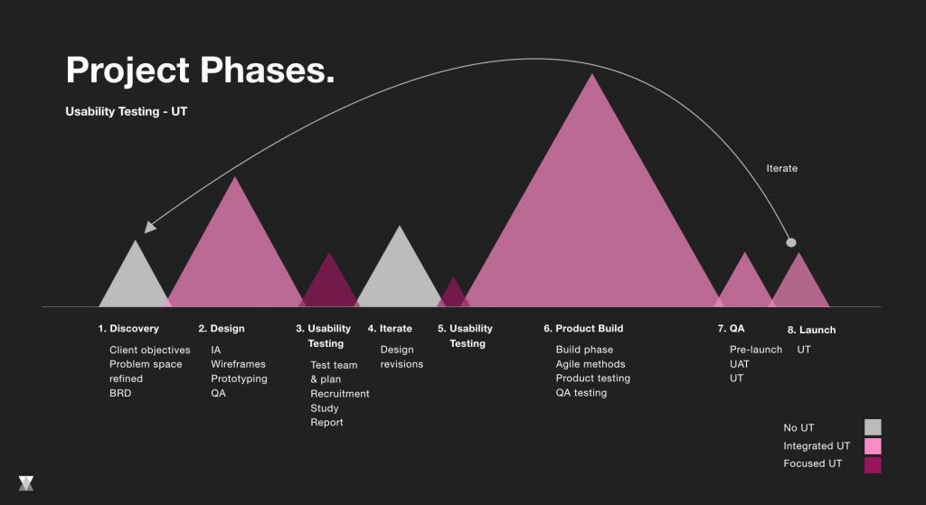
Prototyping.
If we are testing a new product or concept we will either create a prototype for the study, or we may create two versions in order to compare potential solutions. Prototyping is crucial because it can avoid costly mistakes by helping to identify issues with the designs before they go into development. Using prototypes, we gather feedback early on, pivot when necessary, and iterate until we are satisfied with the solution.
Finding usability issues allows us to fix problems during design, which is more operationally efficient than fixing it after it’s been built. Sometimes the insights gathered are also used to inform the product strategy for future versions, so usability testing is in effect, informing innovation. Through prototyping, we can not only clearly understand design intent, but also validate or find errors in the UX design. They also allow us to communicate what the product does for the user, and how it will do it.
If a picture is worth 1000 words, a prototype is worth 1000 meetings. –Saying at Ideo
UX Design toolkit.
We’ll adapt our tools to each specific project and our design team is always experimenting with new software. We’ll usually start conceptual designs with just a whiteboard and post-its, mapping out journeys and task flows. When we’re ready to build a prototype our go-to is Sketch, starting with information architecture diagrams and task flows, then moving from low-fidelity wireframes to high-fidelity artwork. If we’re starting with a more mature product, the UI and components will be more defined so our prototypes will be more refined.
Depending on the project scope and/or client deliverable, we’ll use InVision and InVision Studio as our go-to tools for interactive prototyping. Using them, our team can turnaround a simple prototype in under an hour. Sometimes, however, we’ll want to test a high-fidelity prototype that acts, looks, and functions as close to the real product as possible. If we’re creating animations or more specialized interactions, our team has also used Principle, Flinto, Framer, and Adobe After Effects. You can explore and compare a world of design tools over at Prototypr.
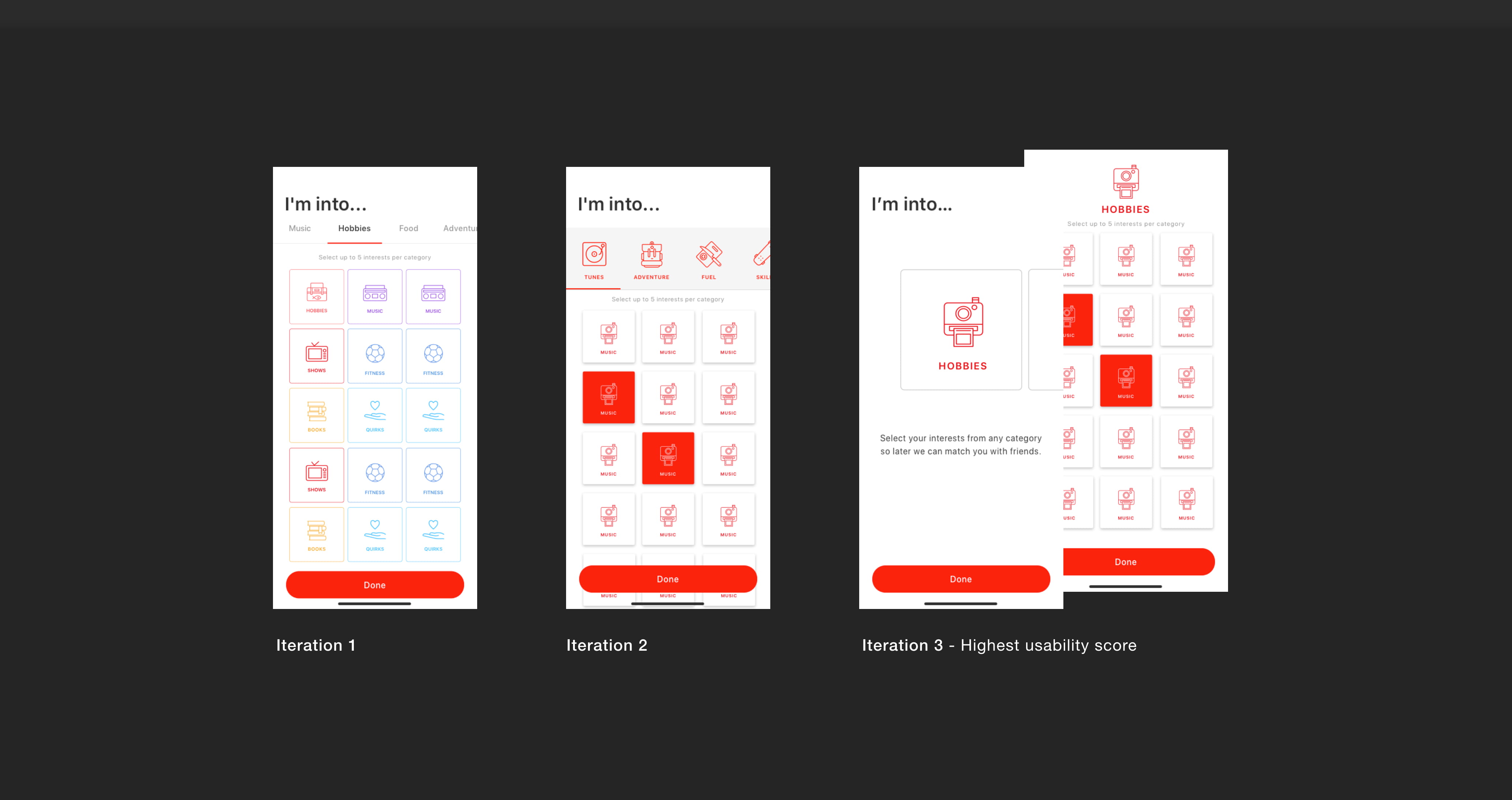
Stages of prototyping iteration for Jelato’s ‘interest selection’ flow during onboarding.
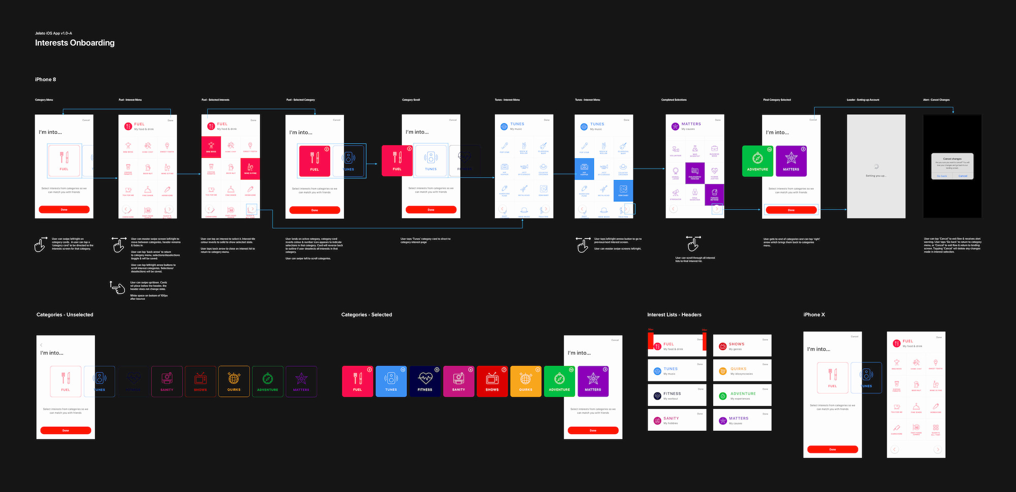 Finished design for Jelato’s ‘interest selection’ flow during onboarding.
Recruiting participants.
For us, participants in our usability testing should represent our product end-users. End-users are identified during our exploration phase, at the beginning of our UX client-discovery process. This is where key demographics and personas are defined that we need to validate the product with. We leverage our network through our sales, marketing, and product teams to find the right people in our target group, and then we’ll reach out to them via email or LinkedIn with a project overview.
For each project, the UX team will create a user-testing scenario which informs whether we’ll have an internal or external focus group. When we tested an internal team portal MVP prototype, for example, the product team invited seven people from aequilibrium’s team over a cross-section of ages, genders, roles, and experiences to take part. When we tested an internal team portal MVP prototype, the product team invited seven people from aequilibrium’s team over a cross-section of ages, genders, roles, and experiences to take part. It’s important to note here that we’re careful not to corrupt the data by having members of our own UX design team participating in or facilitating the tests (with the exception of creating the script), which may produce biased results.
On the flipside, our approach was different for an iOS app we created for Sneaker Con. We flew to New York to attend an event and interviewed a segment of users and then later worked with a dedicated group of sneakerheads (a specific audience segment outside of our company team)to test our designs throughout the product build.
Facilitating usability studies.
With good planning and a well-organized team, usability studies can be turned around quite quickly with massive results for the UX team. In our experience, conducting elaborate tests is not always necessary; in fact, it’s better to do smaller tests more often. Whether it’s a small in-house testing group or a larger and more formal study, the process is still the same:
- Organize the team
- Define your hypothesis
- Finalize the plan
- Write the tasks and script
- Schedule the participants
- Conduct test
- Analyze the data
- Present findings
It’s important to be aware of the time. For example, if we’re recruiting participants from outside of the company, then testing may take longer since it may take a week to send introductory emails, wait for confirmation, and then schedule appointments.
The usability test itself will take one hour. At aequilibrium, our process is to break this hour into three parts: The pre-test interview, tasks and nudges, and the post-test interview. After an introductory warm-up, we start by asking our users a few questions relating to their experience with similar products before testing the product (5-10 mins). After we’ve gathered context from the pre-test interview, we’ll ask the user to perform usability tasks and to give qualitative feedback on certain functions and behaviors (35 mins). After tasks and nudges are completed, we’ll finish up with a post-test interview. Here we’ll ask a few questions with the goal of gathering valuable user insights. We’ll debrief and then end with a thank-you and incentive. (10-15 mins).
From experience in the field, we’ve curated a small set of best practices for how to facilitate an effective usability test. Our first tip is to be relaxed but focused. Learn to listen (instead of trying to lead). Be respectful. Use a high-fidelity prototype. Lastly, make it real.
Reporting.
After we’ve tested usability with all of our participants, we gather to synthesize both the qualitative and quantitative data using our model which allows us to score tasks and reveal insights and pain points. The team will then present the findings to the stakeholders in a presentation debrief, linking all relevant data and documents. Even with qualitative data, we’ll use metrics wherever possible to show results, mainly because it gives context. For example, the statement ‘85% of users want less scrolling’ is a lot stronger than saying ‘a large portion’ or ‘most’ of our users.
Synthesizing and sharing our findings is a crucially important part of the testing process because it informs changes based on data, not opinion. It informs the team and stakeholders of issues and helps them to focus on changing what’s important for the success of the product. We’ll also present future opportunities based on user insights to advise strategy going forward in future versions. This way we can really get the client excited about what’s ahead!
Conclusion.
At aequilibrium, we’re driven by a desire to constantly learn and be informed by our users, and we strive to create products that have the ability to transform peoples lives. Usability studies are a foundational part of our human-centered design process because as David Kelly once said, if you fail faster, you can succeed sooner.
Resources.
User Research Methods: How to Choose the Right One? (Adam Fard)
More than a feeling: Ten design practices to deliver business value (McKinsey)


