


By Daniel Paz, Senior Product Designer, Aequilibrium
(Part of AEQ’s Thought Leadership Series on Digital Transformation for Credit Unions)
In Brief
Credit unions hold a unique position: members are not customers, they’re owners. This creates both opportunity and friction, especially when digital interactions fail to reflect the values and service that define the institution. The challenge isn’t matching big banks feature-for-feature, but designing digital experiences that reinforce why members choose credit unions in the first place.
Understanding What Keeps Members Loyal
Most credit union members didn’t choose their institution by accident; they chose it because something about the credit union aligned with their values. Whether it was community commitment, transparency, or a more personalized approach to service, that decision carried meaningful weight.
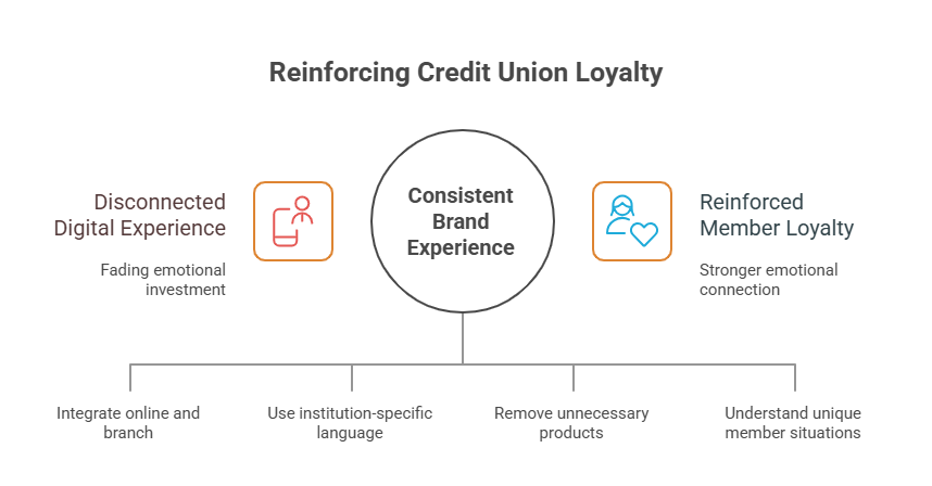
The problem emerges when digital interactions feel disconnected from that choice. A member signs into a digital banking platform that could belong to any bank. The experience feels generic, disconnected from the values that initially drew them to the institution.” They start comparing: “This app is slower than my big bank’s app.” “I can’t find anything.” “Why is this harder?” The emotional investment that brought them in starts to fade.
Loyalty isn’t maintained through feature parity. Big banks will always have bigger budgets for features. Loyalty is maintained through consistency between what the member believes about the institution and what they experience every time they interact with it. If your credit union’s brand promise is “We know you by name,” but members feel like account numbers in your digital experience, that’s friction.
Common friction points that drive members away often aren’t about missing features; they’re about misalignment. Members get frustrated when:
- They solve a problem online, then need to repeat everything when calling the branch because systems aren’t connected
- They see generic banking language that doesn’t reflect the institution’s values or culture
- They can’t find simple answers because the interface is cluttered with products they don’t need
- They feel like their unique situation isn’t understood, and they get the same generic recommendations as everyone else
The design question isn’t “How do we match the big banks?” It’s “How do we make every digital interaction reinforce why members chose us?”
Sometimes this means being different on purpose. A credit union focused on community lending might highlight loan stories from real members instead of generic financial advice. An institution serving a specific demographic might design specifically for that community’s needs rather than trying to appeal to everyone. Intentional differentiation strengthens loyalty; accidental mediocrity erodes it.
Connecting Digital to Branch Experience
The most frustrating moment in modern banking happens when a member walks into a branch after handling things online and has to start from scratch. “Let me look that up in the system.” “I don’t see your recent online transaction.” “Can you tell me what you were trying to do?” The branch staff don’t have context, the member feels like they’re wasting time, and the entire experience feels fragmented.
This is a design problem, not an operations problem. When digital and branch systems aren’t connected, you’re forcing members to live in two separate institutions at the same time.
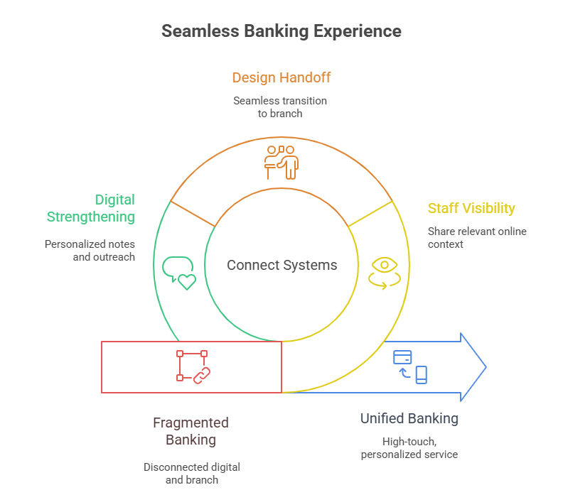
Start by giving staff visibility into what members have already done online. If someone initiated an online account application but didn’t finish, staff should see it. If a member looked at loan options on the app, that context should inform the conversation when they come to the branch. This doesn’t require sharing every digital action; it requires sharing relevant context that helps staff provide better service.
Design the handoff moment. When should a member transition from self-service to speaking with someone? Make it seamless and intentional. “You’ve asked about home equity loans. Would you like to chat with someone who can explain your options?” Then that conversation starts from a position of informed, not from zero.
Use digital channels to strengthen relationships, not replace them. A member receives a personalized note acknowledging their account anniversary. Another gets proactive outreach when their credit history shows improvement. A third gets invited to a financial literacy session tailored to their situation. These digital touches build momentum toward meaningful interactions at the branch.
The branch becomes the high-touch channel for complex conversations, while digital handles routine needs. Both reinforce the same message: “We know you. We care about your success.”
Showing Personalization Without Feeling Invasive
Personalization is powerful until it feels creepy.
Credit unions have legitimate data about members, account history, transaction patterns, and product ownership. This information can be used to create genuinely helpful experiences or to manufacture sales pressure that feels invasive. The difference is usually subtle but always felt by the member.
A helpful personalization: “You’ve been saving consistently for 18 months. You might be ready to discuss investment options.” This acknowledges behavior and opens a conversation.
Invasive personalization: A member logs in and immediately sees an aggressive product recommendation, plastered with urgency signals, positioned before they even see their account balance. Same data, completely different energy.
The design principle is consent and context. Make personalization visible. “Based on your account activity, we think you might be interested in.” Then let members engage or ignore. Provide controls. “Personalize my experience” with the ability to turn specific categories on or off respects member autonomy.

Recommendations should also account for life stage. A member early in their career needs different guidance than someone approaching retirement. A recent graduate has different priorities than someone with young children. Design recommendations that adapt as life circumstances change, and communicate why you’re suggesting something. “You’re eligible for a higher savings rate because of your account age” is transparent and helpful.
The privacy piece matters too. Members should always understand why you’re personalizing something and how their data supports it. When personalization feels mysterious, trust erodes.
Making Self-Service Feel Supported
Not every member wants to talk to someone. Many prefer to solve problems independently. But independence shouldn’t mean abandonment.
Design self-service with intelligence. When a member is navigating a complex process, such as applying for a loan or transferring funds, provide contextual help without forcing it: small help icons, tooltips that explain terms, and next-step guidance. The member stays in control, but they’re never confused.
Know when to intervene gently. If a member is struggling through the third attempt at the same task, that’s a design signal. Either simplify the interface, or offer: “Having trouble? Chat with someone who can walk you through this.” This isn’t pestering, it’s supporting.
Complex processes need guidance. A loan application isn’t something to rush through. Break it into logical steps. Show progress. Explain what information you’re collecting and why. Let members save and return. All of this makes a potentially stressful process feel manageable.
Build in escape routes. If a member starts a process and realizes they need expert help, make it easy to connect with staff without losing their progress. “Switch to assisted application” should save their work and connect them with someone who can finish the conversation correctly.
The goal is autonomy with a safety net. Members feel empowered when they can self-serve, but they also feel protected knowing help is there.
Working Within Operational Realities
This is where many credit unions start compromising on design. “Our core system can’t do real-time balance updates.” “Transfers take two business days.” “We only process applications Monday through Friday.” These operational realities are fundamental, but they can’t become invisible to members or used as excuses for poor design.

Instead, design around them transparently. If balance updates happen overnight, tell members that upfront. “Your balance updates at midnight. Pending transactions show below.” If transfers take two business days, show that timeline before the member initiates the transfer. “This transfer will arrive by Wednesday at 5 PM.”
Manage expectations relentlessly. A member who thinks something will happen instantly becomes frustrated when it takes two days. A member who was told upfront that it takes two days feels like their expectations are being met. The difference is in communication design.
Show progress in long-running processes. If a loan application takes a week to process, don’t leave members wondering what’s happening. “Day 3 of 7: We’re reviewing your information. Next step is credit verification.” This transparency, even if things move slowly, builds confidence.
Batch processing windows shouldn’t be hidden. “We process transfers every morning at 6 AM,” enabling members to plan around it. “Your transfer will be processed in the next batch,” tells them what to expect.
When operational limitations genuinely hurt the experience, acknowledge them as design problems to solve, not forever constraints. Maybe you can’t do real-time settlement, but could you offer a “confidence balance” that shows what’s being processed? Maybe applications take a week, but could you proactively request missing information rather than let applications sit waiting? Operational constraints are starting points for design thinking, not surrender points.
Building Community in Digital Spaces
This is where credit unions have a genuine competitive advantage over big banks.
A big bank’s app is a transaction channel. A credit union’s digital experience can be a community space, not in a gimmicky social media way, but in meaningful ways that reflect the institution’s values.
Highlight member stories. When a member gets a mortgage for their first home, celebrate it. When someone pays off a loan ahead of schedule, acknowledge the financial discipline. Stories of real members build belonging and reinforce that this is a place where people succeed together.
Communicate mission and impact. If your credit union directs profits back to members through better rates or community giving, show that. “This year, we donated $50,000 to local youth programs,” or “Your member-owner rebates totaled $2M” connects digital banking to something bigger than transactions.
Create regular reasons to return. This doesn’t mean gamification or artificial engagement. It means genuine value: Financial literacy resources tailored to member life stages. Quarterly updates on the credit union’s community impact. Early access to rates or products for long-term members. Digital experiences that reward belonging.
Understanding When and Why Members Leave
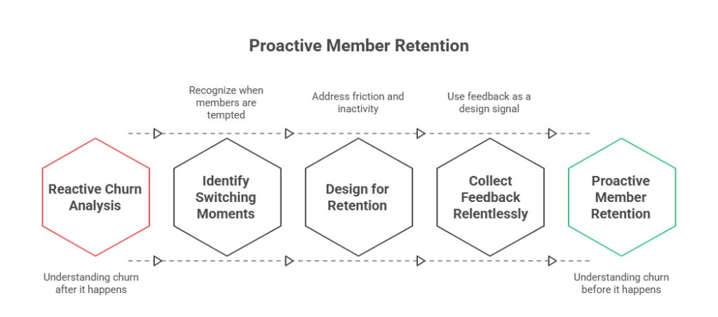
Most credit unions don’t know why members leave until it’s too late. Churn analysis usually happens after the fact.
Identify the moments when switching becomes tempting. Often it’s friction: “I tried to do X, and it was too hard.” Sometimes it’s a better offer: “I got a better rate elsewhere.” Sometimes it’s life changes: “I moved; the new bank has better local service.” Some of it is a poor experience: “I called and waited 40 minutes.”
Design with churn moments in mind. If members frequently struggle with a specific process, that’s a switching moment waiting to happen. If a member gets a rate quote from a competitor, what’s your response? If someone has been inactive for six months, how do you re-engage them?
Inactive members represent recovery opportunities, not losses. A member who went quiet might just be busy. A gentle digital touch, “We haven’t seen you in a while. Anything we can help with?” often brings them back if they’re genuinely considering switching, finding out why gives you a chance to improve.
Collect feedback relentlessly. Not through annoying surveys, but through genuine channels. What do complaints tell you? What do members say when you ask them what’s missing? What do reviews on third-party sites reveal? Every piece of feedback is a design signal.
The most important insight: many members don’t leave because of significant problems. They leave because of a thousand minor frustrations that compound. The design challenge is to catch those minor frustrations early and fix them before they drive someone away.
Conclusion
The credit union advantage has never been about matching big banks in scale or feature breadth. It lies in understanding members deeply and designing experiences that reflect that relationship consistently, digitally, and in-branch. When institutions design with intention, transparency, and empathy, members feel understood, valued, and connected. And that’s what keeps them coming back.
At Aequilibrium, we collaborate with progressive financial institutions to design human-centered digital experiences that strengthen member relationships. If your team is exploring these kinds of digital challenges, we’re always open to sharing insights.
